Building a Website Page - Main Contents

Toms Main Section
So lets have a look at all the elements that have gone into making the main part of this front page, starting from the top we'll look at it section by section.
Section 2. ‐ Intro Text & Images
This next section has been split into two div areas.
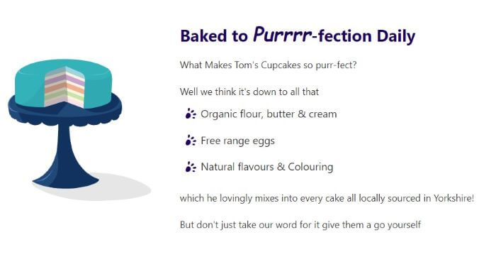
The first smaller div containing a SVG image takes up 30% of the of the screen width. The second larger div takes up the remaining 70% of the screen width. This div contains some text telling users a bit about Tom's cakes. When viewed on a mobile device both div's will cover a 100% of the screen width.
Creative Graphics
I love creative graphics, you may have noticed! So for me adding scalable vector graphics (SVG's) to the mix of visual media is a must wherever possible. They can be informative and work either on their own or with your text to get a message across. They can also be a bit of fun and a page filler, especially when animated too! However they are used they do add an extra layer of interest to the page.
In this section I've not only added the cake image I created. Using CSS I've also added a paw SVG image to the bullet points of my list items. Giving them a little bit more interest and tying them into the overall theme of the site.
Copy & Type
A webpage should strive to have a good balance of text as well as images. After all the user has come to your website to gain information, whether that be about your services, products or educational so we need a little more than just pretty images to give them the whole picture.
Now the subject of typography is a huge one and one I won't be going into now. (phew I hear you say!) So lets just look at what I've done on Tom's page.
I've placed the image first so the start of our text is away from the edge of the page, this not only helps in drawing the eye to it. But also makes it easier for reading especially for those with some reading disabilities. The size ratio of the div's means the text is now looking central helping again to draw the user to it. I've then started the text with a <h2> heading as we've already set the <h1> on the page.
This panel of text even though it doesn't have many words it does in fact offer the user a lot of information. From only 1 heading, 3 small paragraphs and a short list we manage to learn several details about how Tom bakes, his personality and also how he runs his business.
Such as ‐
- He bakes daily so the products in his shop must be fresh.
- He cares about how and what he bakes with by using organic, free range and natural products.
- He's being green and caring for the planet by sourcing local and helping keep his carbon footprint low.
- He also cares about his community by supporting other local independent businesses.
So with some careful planning we can paint a picture with the words we use. That not only gets a single detail across but several all at once.